10 Secrets of Master Painter Color Palettes for Designers
Color is the silent language of design, yet most digital creators rely on palette generators that recycle the same muddy pastels. Meanwhile, master painters like Monet, Vermeer, and Van Gogh spent centuries perfecting color relationships in their works. PaletteInspiration.com changes that: it's a browsable archive of color palettes extracted from over 3,000 masterpieces. No algorithms guessing what works—just real, empirical pairings from actual paintings. Here are ten things every designer should know about this resource and the hidden wisdom of painterly color.
1. Why Master Painters Offer Better Color Education Than Modern Generators
Most color palette tools rely on a handful of mathematical rules—complementary, analogous, triadic—and converge on the same five muted pastels. But painters like Raphael and Vermeer didn't follow rigid formulas; they observed light, emotion, and context. Their palettes evolved over centuries of trial and error. PaletteInspiration.com taps into that body of work, making it possible to learn from 3,000+ historical sources. Instead of sterile theory, you see what actually worked in masterpieces. This empirical approach is far richer than any algorithmic shortcut.
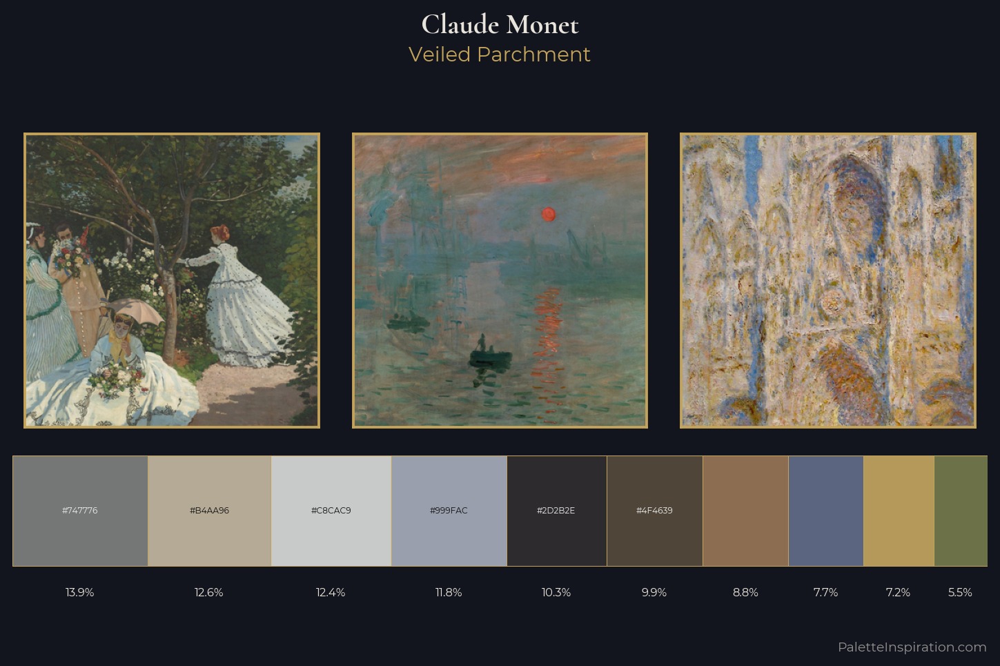
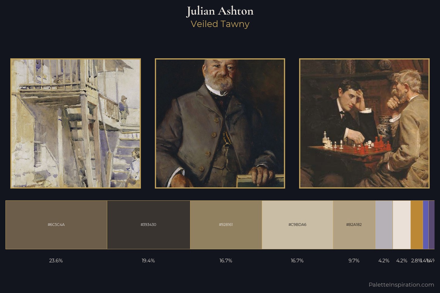
2. The Archive Covers 3,000+ Works from Monet to Van Gogh
Whether you love the luminous blues of a Monet water lily or the fiery oranges of a Van Gogh sunflower, the archive includes them all. You can search by artist, era, or dominant hue. Each painting is broken down into its core color palette, showing how masters balanced warm and cool tones. For example, Vermeer often paired ultramarine with amber highlights—a combination rarely suggested by standard generators. This breadth gives designers a cross-cultural, multi-century library of proven color combinations.
3. The Color Harmony Explorer Uses Real Pairing Data, Not Rules
The standout feature is the Color Harmony Explorer. Drag the wheel to any color and it instantly shows which hues master painters historically paired with it. This isn't based on standard color theory—it's pure co-occurrence across thousands of paintings. If you pick a deep crimson, the tool reveals that painters often matched it with muted gold or slate blue, not just the textbook complementary of green. This real-world data helps you make bold, nuanced choices that feel intentional rather than generic.
4. No Signup, No Paywall, No Email Capture
Privacy-focused design tools are rare. PaletteInspiration.com is completely free and requires no login or email. You can start exploring immediately. This is especially valuable for students, freelancers, and hobbyists who want to experiment without barriers. The maker built it out of curiosity, not profit—so you get unfiltered access to the world's greatest color lessons.
5. Forget Pastel Predictability—Discover Unexpected Combinations
Standard generators are notorious for churning out safe, bland palettes. Master painters, however, delighted in clashing hues: think of Van Gogh's violet skies next to yellow stars. The archive reveals that many masterpieces use high-chroma colors in small doses against neutrals. For example, a single red poppy in a green field can anchor an entire composition. You'll find pairings that break the rules but feel supremely balanced because real painters tested them.
6. The Tool Is Built on Co-Occurrence from Thousands of Paintings
Instead of applying generic color theory, the system analyzes the actual frequency with which colors appear together in artworks. This data-driven method surfaces patterns like: warm ochre frequently appears with cool teal in Renaissance portraits, or that purples and yellows co-occur far more often in impressionism than in classicism. This empirical approach is a goldmine for designers creating thematic color schemes—whether for branding, UI/UX, or editorial design.
7. It's Ideal for Branding and UI Design Projects
Brand color choices need to communicate without words. Painting masters understood this intuitively: a palette can evoke serenity, drama, or nostalgia. With PaletteInspiration.com, you can search for palettes from works with a specific mood or era. For example, a modern fintech brand might borrow the cool greens and white from a Monet landscape to convey trust and growth. The Harmony Explorer helps you test those combinations against real historical precedent.
8. Feedback from the Community Is Driving Improvements
The maker actively encourages feedback, as seen in the original Hacker News post (53 comments so far). Users have requested features like saving favorite palettes and exporting hex codes. The current version focuses on exploration; future updates may add API access or downloadable swatches. Being a community-driven project means it evolves to serve real design needs without corporate bloat.
9. It's a Free Alternative to Expensive Color Analysis Tools
Professional color analysis software can cost hundreds of dollars per year. PaletteInspiration.com offers a comparable depth of historical reference at zero cost. For educators, it's a fantastic resource to show students how color theory actually appears in art history—not just in textbooks. You can cross-reference a palette from a Rembrandt with one from a contemporary app, bridging the gap between fine art and digital design.
10. Start Exploring Right Now Without Commitment
The best way to understand the power of painterly palettes is to try the Color Harmony Explorer yourself. Pick any color you're considering for a project—say, a navy blue for a website header—and see how master painters paired it with warmer or cooler tones. You'll quickly notice that the traditional color wheel pales in comparison to 3,000 years of empirical knowledge. Dive in and let the masters mentor your next design.
Color is too important to leave to algorithms. PaletteInspiration.com returns the power of palette creation to the artists who mastered it—and now to you. Whether you're a seasoned designer or just starting out, this free archive offers infinite inspiration grounded in real masterpieces. The only thing missing? Your next creation.
Related Articles
- Swift 6.3 Arrives with Enhanced Cross-Platform Build Tools and Community Updates
- How to Build a Statewide EdTech Vetting System: A Step-by-Step Guide for Advocates
- How to Secure a Steam Machine Without Scalpers: A Step-by-Step Guide to Valve’s Reservation Queue
- Understanding HarmonyOS: A Comprehensive Guide to Huawei's Open-Source Operating System and Its Rapid Growth
- Princeton Ends 133-Year Honor Exam Tradition with New Proctoring Mandate
- Kubernetes v1.36 DRA: Smarter Resource Allocation with Priority, Taints, and Partitioning
- PhpStorm 2026.2 Early Access: Everything You Need to Know
- From Spinners to Stories: Rethinking AI Transparency in Interface Design